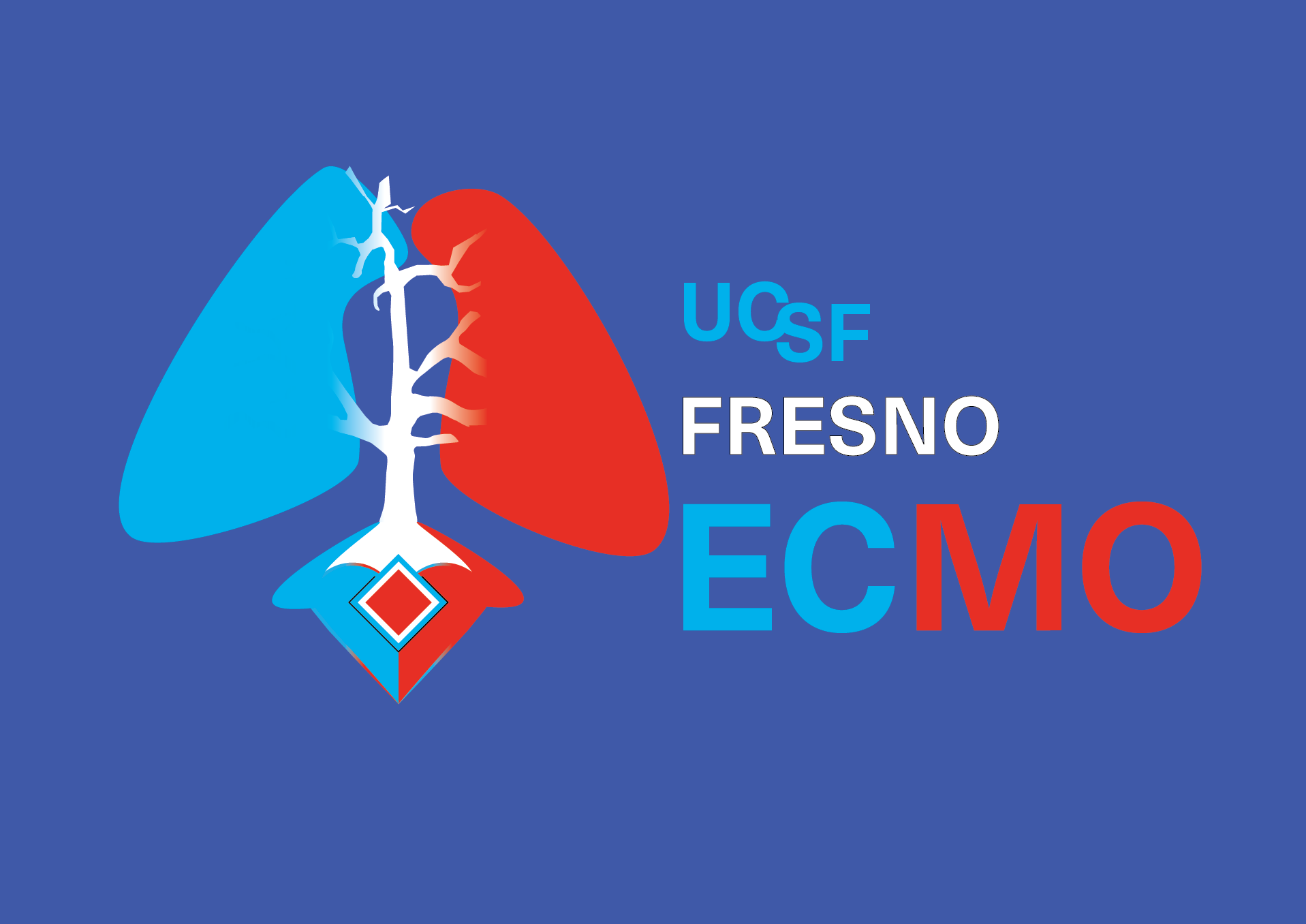
I worked with a sub-specialty medical group in Fresno, CA to develop a new logo for the ECMO team. ECMO (extracorporeal membrane oxygenation) technology pumps and oxygenates a patient's blood outside the body, taking work off of the heart and lungs, so they can rest.
First, we met over Zoom and discussed themes, specific colors, and important symbols to keep from previous designs. The ECMO submitted to me a rough rough design on which I built the idea for my concept designs. After creating draft concepts, I met with the ECMO team via Zoom to discuss which design they would like to further develop into a logo.
They chose the third image, the blue and red tree with foliage texture, and the ECMO machine at its base sending its tubes into the tree.
After more reworkings, the team suggested the UCSF title be bigger. And I offered different versions of the tree design, but the none of the newer tree versions maintained simple attractiveness of the earlier tree design. So, we stayed with the earlier style.

After deciding on the tree design, we reworked the titles and colors until the team felt we had the best version. Ultimately, the dark royal blue became the best version. I included the lighter blue designs and suggested using it for darker jackets or scrubs.